
Questions & Answers
Carpet Colours & Interior Styling Questions & Answers Page 2
The Carpet Colours & Interior Styling Conversation
Browse practical BCC answers about Carpet Colours & Interior Styling. These pages preserve real customer questions and organise carpet choices, installation checks, material details, room suitability and useful flooring research.
For a vintage-inspired look with subtle patterns, consider: 1) Woven Textured Loop Carpet in Grey Check — a classic check pattern. 2) Woven Textured Loop Carpet in Cream Brown — warm, understated pattern. 3) Sisal Look Loop Pile Carpet in Natural Tones — rustic texture. 4) Woven Wool Carpet in Soft Beige with Subtle Patterns — refined, timeless styling. Vintage-style carpets can offer timeless appeal with natural materials. To view current selections or im…
Carpet Colours & Interior Styling show me some interesting carpets and colours you keepBCC offers a wide range of carpet styles and colours to suit different spaces. Current options include woven textured loop carpets in blue check and cream tones; luxury plush cut carpets in light grey; wool sisal-look loop pile in natural finishes; and charcoal wool cut pile for a refined look. We also offer customised rugs and designs to suit your space. If you’d like to see more options or obtain additional information about specific styles, we can provi…
Carpet Colours & Interior Styling Do you have dark blue carpets?Dark blue is a popular choice and is produced across a range of carpet constructions and fibres, from textured loop and cut piles to softer velour-style finishes; each has different appearance and performance trade‑offs. When choosing a deep blue carpet consider pile type, fibre and underlay for durability, feel and stain performance — these factors affect cost and suitability. Some carpet ranges are available in wider formats, which can reduce joins; curr…
 44 Q&A
Showroom, Contact & Sydney Service Areas
44 Q&A
Showroom, Contact & Sydney Service Areas
 54 Q&A
Carpet Buying Advice, Pricing & Quotes
54 Q&A
Carpet Buying Advice, Pricing & Quotes
 62 Q&A
Carpet Types, Brands & Product Ranges
62 Q&A
Carpet Types, Brands & Product Ranges
 10 Q&A
Luxury, Specialist & Commercial Carpets
10 Q&A
Luxury, Specialist & Commercial Carpets
 14 Q&A
Eco-Friendly, Allergy & Health Considerations
14 Q&A
Eco-Friendly, Allergy & Health Considerations
BCC stocks a variety of blue tones across different carpet constructions, from textured loop and woven styles to plusher piles; the exact shade, fibre content and finish vary by product. Choice of blue should consider room size, lighting and the desired mood — cooler blues can feel more formal, while warmer blues create a cosier atmosphere. Some carpet ranges are available in wider formats, which can reduce joins; current widths vary by product and should …
Carpet Colours & Interior Styling which of your carpets goes well with linen fabricsCarpets that pair well with linen fabrics typically feature soft neutrals and natural textures that complement the calm, light look of linen. Good options include: - Woven wool carpets in cream, beige or soft grey for a quiet backdrop. - Textured loop-pile carpets in neutral, earthy tones to add depth without competing with linen. - Shag or plush piles in gentle colours to add warmth and softness. Practical tips: choose hues that stay understated so the li…
Carpet Colours & Interior Styling Is yellow carpet too bright for a kids' room?Yes, a yellow carpet can work in a kids’ room. It can create a cheerful, uplifting atmosphere and stimulate energy. The best choice depends on the shade, room size, and existing décor: lighter yellows can brighten smaller spaces, while warmer or deeper yellows can make a bold statement. Pair yellow with neutral walls and furnishings to balance brightness. If you’re unsure, testing samples in the room can help you see how the colour behaves in daylight and …
 17 Q&A
Customer Reviews, Projects & Business History
17 Q&A
Customer Reviews, Projects & Business History
 99 Q&A
Wool Carpets & Natural Fibres
99 Q&A
Wool Carpets & Natural Fibres
 32 Q&A
Carpet Trends, Style & Inspiration
32 Q&A
Carpet Trends, Style & Inspiration
 20 Q&A
Woven Wool, Axminster & Wilton Carpets
20 Q&A
Woven Wool, Axminster & Wilton Carpets
 16 Q&A
Loop Pile & Textured Carpets
16 Q&A
Loop Pile & Textured Carpets
Purple can be a lively and playful choice for a children’s playroom, but consider trade‑offs: darker or saturated purples can hide marks but may darken the room, while paler tones keep the space bright. Prioritise durable, easy‑care constructions and colours that tolerate frequent use and cleaning. Some carpet ranges are available in wider formats, which can reduce joins in larger play areas; current widths vary by product and should be confirmed. For curr…
Carpet Colours & Interior Styling Need carpet for a snooker room want a pattern what do you suggestA patterned carpet can be an excellent choice for a snooker room, offering character and helping to mask wear. Consider geometric repeats for a contemporary look, traditional motifs for a classic club feel, or restrained stripes to subtly influence the perceived width of the room. Textured loop patterns add visual interest and tend to conceal foot traffic and marks. Trade-offs include pattern scale versus visual distraction — a large, bold repeat can domin…
Carpet Colours & Interior Styling Do you have a good colour range of carpet?BCC can advise on a wide spectrum of carpet colours to suit different interiors, from neutral palettes such as beiges, creams and greys to richer, bolder tones for statement installations. Textures and multi‑tonal patterns also influence how colour reads in a room and how well it hides wear or soiling. Some ranges are offered in wider formats, which can reduce joins; current widths vary by product and should be confirmed. For specific colour availability, …
 20 Q&A
Stair Runners
20 Q&A
Stair Runners
 41 Q&A
Stair Carpets & Landings
41 Q&A
Stair Carpets & Landings
 31 Q&A
Pet, Family & Heavy-Traffic Carpets
31 Q&A
Pet, Family & Heavy-Traffic Carpets
 11 Q&A
Coastal, Hampton & Natural-Style Carpets
11 Q&A
Coastal, Hampton & Natural-Style Carpets
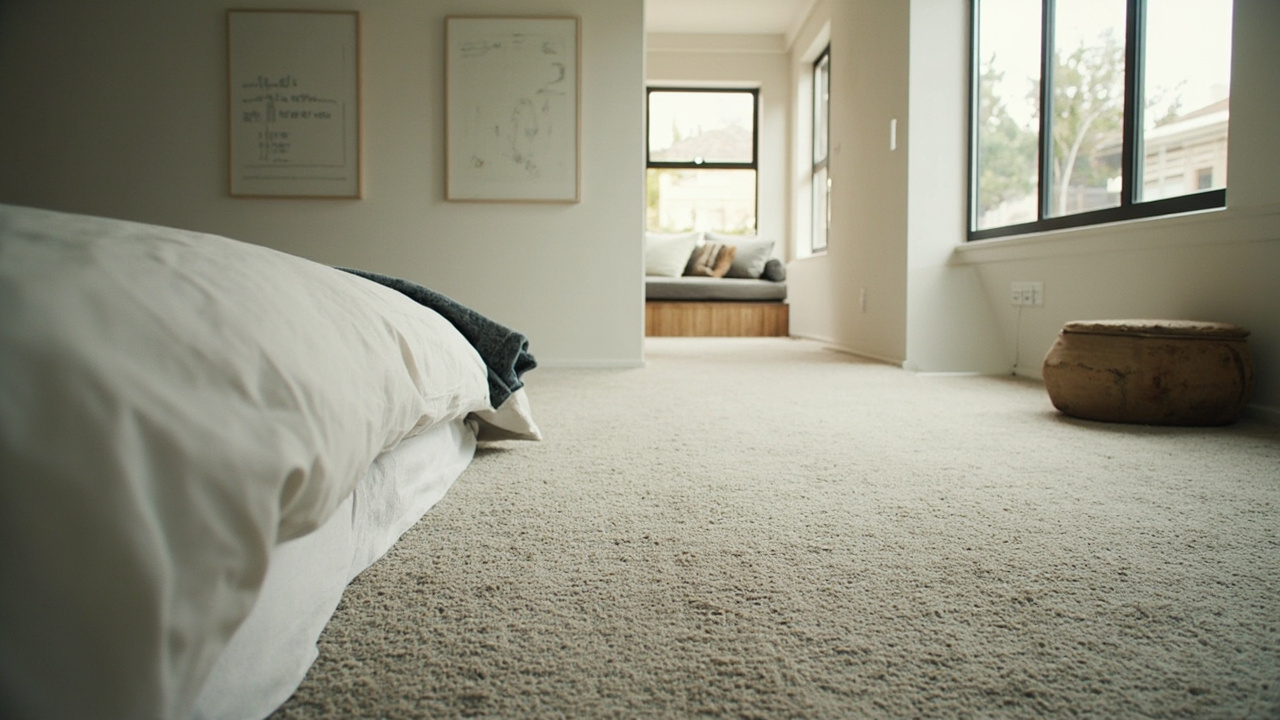 14 Q&A
Bedrooms, Hallways & Living Areas
14 Q&A
Bedrooms, Hallways & Living Areas
Patterned woven carpets can add character to a games room while providing practical wear. We can discuss suitable patterns and colours in the Taren Point showroom. If you are planning a large space, note that wider-width woven carpets may reduce visible joins where appropriate. For current options and availability, contact the showroom on 02 9526 6421 or visit Unit 3/46 Bay Rd, Taren Point, NSW.
Carpet Colours & Interior Styling What colours do your plush pile carpets come in?Plush pile carpets are offered in a broad spectrum of colours to suit different interiors: neutrals (beige, cream, taupe and greys), earthy tones, moody dark shades and brighter accent colours. The right hue depends on light, room size and the desired look — lighter tones enlarge a space, while deeper shades add warmth and depth. Some carpet ranges are available in wider formats, which can reduce joins; current widths vary by product and should be confirme…
Carpet Colours & Interior Styling Which carpet colour goes best with antique white walls? Can you show some colour examples?Antique white walls pair well with a range of soft, muted tones. Consider warm neutrals such as soft beige, light taupe or creamy ivory for a classic, harmonious look; muted blues or sage greens work well where a subtle contrast is desired, and warm greys can provide a contemporary backdrop. Each choice affects perceived warmth and light in a room, so trade‑offs include stain visibility, contrast with furniture and the desired formality. Some carpet ranges…
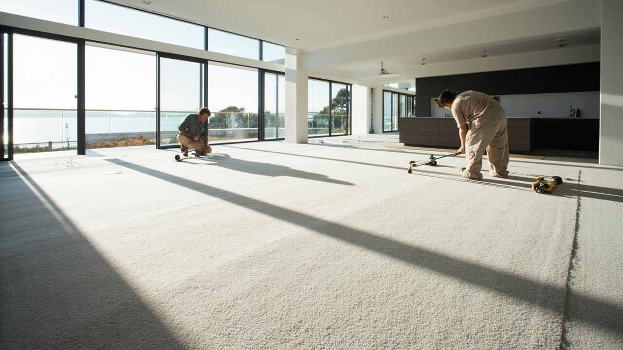 33 Q&A
Wide Carpets, Rugs & Custom Sizes
33 Q&A
Wide Carpets, Rugs & Custom Sizes
 24 Q&A
Underlay, Comfort & Sound Reduction
24 Q&A
Underlay, Comfort & Sound Reduction
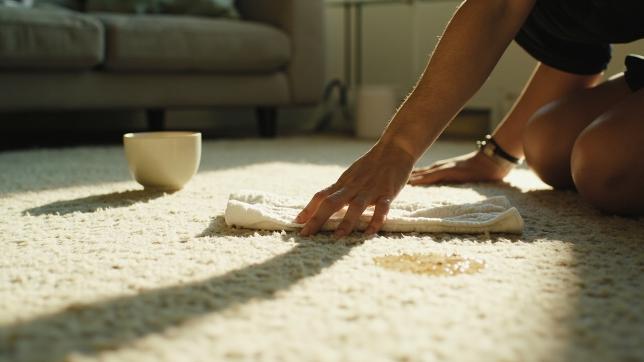 34 Q&A
Cleaning, Stains & Carpet Maintenance
34 Q&A
Cleaning, Stains & Carpet Maintenance
 21 Q&A
Installation, Measuring & Furniture
21 Q&A
Installation, Measuring & Furniture
Choosing a carpet colour depends on room light, furniture, desired mood and lifestyle. Neutrals such as beige, grey and cream are versatile and work across many schemes; warm tones add cosiness, while cool blues and greens create a calm atmosphere. Darker colours can hide stains and define a space but may make smaller rooms feel smaller; lighter tones brighten rooms but may show wear more readily. Consider future décor changes and maintenance needs when de…
Carpet Colours & Interior Styling What carpet goes with satin finish timber flooring?What pairs well with satin‑finish timber depends on the room’s light and the desired mood. Neutral and soft tones — warm beiges, creams, soft greys or muted earthy colours — complement timber without competing. Texture is equally important: low‑profile loop or short‑pile plush carpets create a neat transition from timber, while textured weaves add depth in larger spaces. Trade‑offs include light colours showing more soiling and darker tones masking wear bu…
Carpet Colours & Interior Styling What’s coordinating carpet colours go with Dulux natural white painted walls?Dulux Natural White works well as a versatile backdrop for many carpet colours. Practical combinations include: neutral tones such as beige, soft greys and taupe for a calm, adaptable scheme; earthy hues like warm browns or muted greens for a cosy, grounded feel; and soft pastels such as pale blues or dusty pinks for gentle contrast. Patterned or textured carpets (for example loop pile or Berber) can add interest while keeping the palette cohesive. Availab…
Natural light changes how carpet colours look. Direct sunlight can intensify vibrancy, while soft, diffused light may mute tones. Time of day matters: morning light often enhances cooler shades, afternoon light can enrich warmer colours. The room’s orientation also matters: north-facing rooms feel softer light that can make warm tones stand out; south-facing spaces are brighter and can shift colour perception. Surrounding walls and furnishings reflect and …
Carpet Colours & Interior Styling What’s the best colour and texture carpet to match my oak timber?To complement oak timber flooring, consider: Colour ideas — warm neutrals (beiges, light browns or taupe), warm greys, creams or ivory for contrast, and earthy tones like olive or muted terracotta. Texture options — woven for depth, plush for softness, or loop for durability. Wider widths can reduce joins in large rooms when a suitable product is chosen. For tailored styling options and availability, please call the Taren Point showroom on 02 9526 6421.
Carpet Colours & Interior Styling What’s the best colour carpet to go with my new paint colour antique white?Antique White is a versatile base that pairs well with a range of carpet colours. For a timeless look, try warm neutrals such as beige or cream, or taupe. If you prefer a contemporary feel, lighter or mid greys sit nicely with antique white without competing with it. For a softer, more pastel effect, pale blue or sage can work well, while a chocolate brown offers a rich, cosy contrast. When choosing, consider the atmosphere you want: lighter colours feel a…